ハンコの印象は、文字のかたちで変わります。まずは六つの書体から。それぞれの特徴と使われ方を、ゆっくり見ていきましょう。Discover six styles used in Japanese seals: their shapes, their character, and the purposes they can serve.
ハンコの書体入門 / 日本語・EnglishAn introduction to hanko lettering / 日本語・English
Compare / 和
同じ「和」で、見比べる。Compare the same character: 和.
線の形、読みやすさ、雰囲気の三つを手がかりに見てみましょう。現在は篆書体・隷書体・行書体の3点を掲載しています。残る3書体は見本の確認中です。Look at stroke shape, legibility and overall character. Three specimens are available: seal, clerical and running script. The other three await verified specimens.
篆書体Tensho · Small seal script
和見本を読み込み中Loading specimen
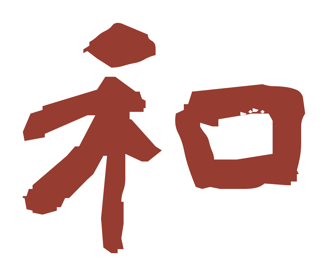
小篆の字形見本。現代の「和」と線の組み立てを比べてみましょう。A small-seal-script specimen. Compare its structure with the modern character 和.
崇羲篆體/中央研究院。王心怡氏揮毫。Chong Xi Small Seal / Academia Sinica. Calligraphy by Wang Hsin-Yi.
印相体Insō
見本は未準備Specimen not ready
線の広がりと配置に注目How strokes fill the seal face
書体と利用許諾を確認できる見本が揃い次第掲載します。Awaiting a specimen with verified style and usage permission.
古印体Koin
見本は未準備Specimen not ready
丸みや墨だまりの表情に注目Rounded strokes and ink-pool effects
書体と利用許諾を確認できる見本が揃い次第掲載します。Awaiting a specimen with verified style and usage permission.
隷書体Reisho · Clerical script
横方向の広がりと払いを、行書の線の流れと見比べてみましょう。Compare its broad form and flaring strokes with the running-script specimen.
青柳隷書しも Ver.2.01/青柳衡山氏揮毫・SIMO氏フォント化。Aoyagi Reisho SIMO v2.01. Calligraphy by Aoyagi Kouzan; font by SIMO.
楷書体Kaisho
見本は未準備Specimen not ready
独立した点画の明瞭さに注目Clearly separated strokes
書体と利用許諾を確認できる見本が揃い次第掲載します。Awaiting a specimen with verified style and usage permission.
字形の見本と、完成した印影は別のもの。A letterform specimen is not a finished seal.
掲載見本はフォントの「和」を図として表示したものです。彫刻・印面の配置・朱文白文の加工はしていません。印にするときは線の太さ、余白、枠との関係などを調整するため、この見本がそのまま仕上がりになるわけではありません。読みやすさや雰囲気の感じ方にも個人差があります。The specimen shows the font’s character as a graphic. It has not been carved, composed into a seal or converted into red/white seal lettering. Stroke weight, space and borders require further decisions. Perceptions of legibility and mood vary.
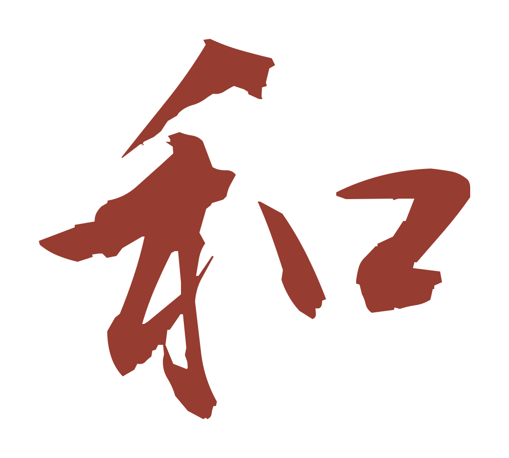
行書見本:青柳衡山氏「衡山毛筆フォント行書」。公式配布:武蔵システム。公式利用条件で商用利用可・制限なし、ロゴ等への利用可を確認(2026年11月5日)。Running-script specimen: Kouzan brush running script by Aoyagi Kouzan, distributed by Musashi System. Official terms permit unrestricted commercial use and logos; checked 5 November 2026.公式出典・利用条件Official source & usage terms
追加見本の出典・利用条件Sources and permissions for added specimens
隷書:青柳隷書しも(青柳衡山氏揮毫、SIMO氏フォント化・著作権)。同梱「フォントの使用方法」で使用条件なし・商用可・連絡不要を確認。見本は字形をSVG出力したもので、フォントファイルは配布していません。Clerical script: Aoyagi Reisho SIMO (calligraphy by Aoyagi Kouzan; font and copyright by SIMO). The bundled instructions allow use without conditions, including commercial use, with no contact required. The glyph is rendered as SVG; the font file is not distributed.公式配布元Official distribution · 同梱使用条件Bundled terms (Japanese)
01 / Lettering
書体を知る、最初の一歩。Get to know the styles.
「書体」は文字の形の様式です。同じ書体でも、字形の選び方や配置、彫り方によって印影は変わります。以下は一般的な特徴の説明で、特定の制作者の仕上がりを示すものではありません。A script describes a style of letterforms. Character choice, composition and carving can all change the final impression. These descriptions introduce general traits rather than any particular maker’s work.
01
篆書体
てんしょたい Tensho · Seal script
曲線と、古い文字のかたち。
古い漢字の形を受け継ぎ、曲線や丸い折れが特徴です。現代の文字と形が異なるため、読み慣れるまで時間がかかることもあります。An older form of Chinese characters, often with rounded turns and curves. Some forms differ markedly from modern writing. Used in practical seals and artistic seal carving.
使われる場面:実用印や篆刻で見られます。落款では、文字そのものの造形を味わう入口になります。
参考Sources 1・2
02
印相体
いんそうたい Insō · Adapted seal lettering
印面に広がる、組み合わせの妙。
篆書をもとに、線や配置を印面に合わせて構成する印鑑用の書体です。「吉相体」とも呼ばれ、文字が枠に接するように調整される例があります。Seal lettering adapted from seal script, with strokes arranged across the seal face and sometimes joined to its border. Also called Kissō. Seen in personal and banking seals; treatment varies by maker.
使われる場面:実印・銀行印などの選択肢として見られます。名称や仕上げは制作者によって異なります。
参考Sources 2
03
古印体
こいんたい Koin · Traditional seal lettering
丸みと、かすれの表情。
丸みのある線や、墨だまり・欠けを思わせる表現が特徴の印鑑用書体です。古い印の雰囲気と、名前の読み取りやすさを楽しめます。Rounded strokes and details resembling ink pooling or worn edges give this seal lettering an aged character. Common in everyday name seals.
使われる場面:認印でよく使われます。古風な表情を好むときの候補です。
参考Sources 3
04
隷書体
れいしょたい Reisho · Clerical script
横に伸びる、穏やかなリズム。
横に広がる字形と、波磔(はたく)と呼ばれる特徴的な払いが見どころです。印面に収める際には、形や線の調整が加わります。Broad forms and distinctive flaring strokes create a horizontal rhythm. Used for everyday seals where legibility and character are valued; seal layouts modify the original proportions.
使われる場面:読みやすさや横方向の広がりを楽しみたい認印などで見られます。
参考Sources 1・4
05
楷書体
かいしょたい Kaisho · Regular script
一画ずつ、はっきり伝える。
点や画を大きく崩さず、文字の骨格を明瞭に示す書体です。見慣れた字形に近く、名前を読み取ってもらいやすいのが魅力です。Clearly articulated strokes preserve a familiar character structure. A useful option for everyday seals where the name should be readily understood.
使われる場面:認印や、名前を明確に伝えたい場面の候補です。
参考Sources 1・5
06
行書体
ぎょうしょたい Gyōsho · Running script
つながる線に、手の動きを感じる。
点や画の一部を続けたり省いたりして、流れを持たせた書体です。崩しの程度によって読みやすさや印象が変わります。Connected or abbreviated strokes convey the movement of writing. Legibility varies with the degree of simplification. Consider it for expressive everyday or artistic seals, checking fine lines at actual size.
使われる場面:柔らかい表情の認印やアート用途の候補です。小さな印では細い線の再現も確認しましょう。
参考Sources 1・5
この解説欄の書体名は通常文字です。字形見本は上の比較欄に掲載しています。未確認の見本は使用していません。These style names use ordinary interface text. Letterform specimens appear in the comparison section above; no unverified specimens are used.
02 / Purpose
作品に添える印。手続きに使う印。Artistic marks and practical seals.
落款・アートの印Seals for art
落款印は、書や絵に作者の名前・雅号などを添える印です。篆刻では文字の選択、余白、線と刀の表情を組み合わせて表現します。篆書以外の書体も使われます。An artist’s seal may accompany a signature or art name on calligraphy or painting. Seal carving brings together lettering, negative space and the expression of the cut. Seal script is common, but other scripts are also used.
実印・銀行印・認印Seals for everyday use
実印は自治体に登録した印鑑、銀行印は金融機関に届け出る印鑑、認印は日常の確認などに使う印鑑です。用途の呼び名であり、書体の名前ではありません。A jitsuin is a seal registered with a municipality; a ginkōin is lodged with a financial institution; a mitomein is used for everyday acknowledgement. These are purposes, not script styles.
用途を決めてから、条件を確認。Check the requirements for your purpose.
実印の登録可否は書体名だけでは決まりません。氏名の表記、寸法、材質、印影の鮮明さなど、居住地の自治体の条件を確認してください。銀行印も利用先に確認が必要です。落款用の雅号・絵柄・白文の印が、そのまま登録できるとは限りません。Registration depends on more than the script: check your municipality’s requirements for names, dimensions, materials and clarity. Ask your bank about its own conditions. An artistic seal with an art name, imagery or white lettering may not be accepted.
「吉相」という名称で運勢が良くなることや、複雑な書体だけで偽造を防げることは保証しません。書体の見た目と、防犯上の管理は分けて考えましょう。The term “Kissō” does not guarantee good fortune. Complex lettering alone does not guarantee protection against forgery. Appearance and secure handling should be considered separately.
03 / Carving
朱文と白文は、書体ではなく彫り方。Red and white describe carving, not script.
朱文(しゅぶん)Shubun · Red lettering
文字の線を残し、周囲を彫り下げます。押すと白地に赤い文字が現れます。陽文とも呼ばれます。The strokes remain raised while the surrounding area is cut away. The impression shows red lettering on a white ground, also called relief carving.
白文(はくぶん)Hakubun · White lettering
文字の線を彫り込みます。押すと赤い地に白い文字が現れます。陰文とも呼ばれます。The strokes are incised into the surface. The impression shows white lettering in a red field, also called intaglio carving.
参考 6。冒頭の赤い図形は、このページ用に作成した抽象図案です。文字や実在の印影の見本ではありません。Source 6. The red motif above is an original abstract graphic, not lettering or an actual seal impression.
04 / Further reading
参考資料Sources & further reading
特徴と用途を要約・編集しています。資料の作品・印影画像は転載していません。Descriptions are editorial summaries. No artwork or seal images from these sources are reproduced.
資料確認日:2026年11月5日。横浜市の条件は一例です。お住まいの自治体・利用先の最新案内をご確認ください。Sources checked: 5 November 2026. Yokohama is one local example; consult your own municipality and institution for current requirements.